How To Design Charts With A Color Blind Friendly Palette

Colors play a central role in data visualization. But what if your readers are color blind?

According to Color Blind Awareness, color blindness affects 1 in 12 men (8%) and 1 in 200 women (0.5%). There are an estimated 300 million color blind people worldwide, including Mark Zuckerberg, Bill Clinton, and Prince William!

Take this color blind test online to check whether you are color blind or not.

Optimizing your graphics can help make them more accessible—and that doesn’t mean banishing color from your charts and graphs either.

It means ensuring people with visual impairments can understand your designs with a WCAG contrast checker.

Contrary to popular belief, more than 99% of colorblind people can, in fact, see color—just not in the same way as someone who isn’t impacted by color blindness.

In this guide, we’ll break down the different types of color blindness and their special considerations with respect to data visualization. We’ll also show you how to effectively use color blind friendly palettes to make your graphics available to a wider range of people.

What Is Color Blindness?

Color blindness also known as color vision deficiency (CVD) is a deficiency in distinguishing between different colors. 

It occurs when light-sensitive tissue in the back of the eye—the retina–fails to properly respond to variations in wavelengths of light, which enable people to see different colors.

Although color blindness is primarily an inherited condition, it can also result from cataracts or trauma to the eye, as well as several diseases, including Parkinson’s, Kallman’s Syndrome, and diabetes. 

Damage to the retina caused by aging can additionally cause color blindness.

What Are The Three Types Of Color Blindness?

There are three distinct types of color blindness:

Red-Green Color Blindness

According to Colblindor, 99% of all color blind people suffer from red-green color blindness. This is further broken down into two distinct categories:

Red-green color blindness is inherited and affects males more than females. The reason for this is that the genes responsible for this condition are contained within the X chromosome.

Because women have two X chromosomes, any deficiencies in one will typically be compensated by the other. Men, however, only have one X chromosome and don’t have a “spare” to fall back on.

Blue-Yellow Color Blindness

People who suffer from blue-yellow color blindness have difficulty distinguishing between blue and yellow colors. This particular form of color blindness also known as Tritanopia — is far less common than its red-green counterpart.

In fact, according to the U.S. National Library of Medicine, blue/yellow color blindness affects fewer than 1 in 10,000 people worldwide.

Because Tritanopia isn’t caused by a genetic trait linked to the X chromosome, it is equally present in both men and women.

Complete Color Blindness

People who suffer from complete color blindness also known as Monochromacy — are unable to distinguish between any colors at all. Monochromacy is extremely rare, occurring in 1 in 33,000 people, according to Colour Blind Awareness.

Why Is Color So Important In Data Visualization?

Color plays a significant role in data visualization. For starters, colors are used to highlight important information, as well as illustrate relationships between various types of data.

Color also plays an instrumental role in guiding the viewer’s eye. It can even be used to stimulate emotion through color psychology.

You can even argue that the colors used in charts and infographics tell the story of the data they represent. As Eva Murray writes in Forbes:

In data visualization, color sets the tone and enforces a message for the underlying visual display. It creates a certain atmosphere and can turn an unassuming visualization into an emotion-filled data story.

Knowing how to pick colors is important, but when you’re optimizing for accessibility, there’s more to consider than color theory and design composition.

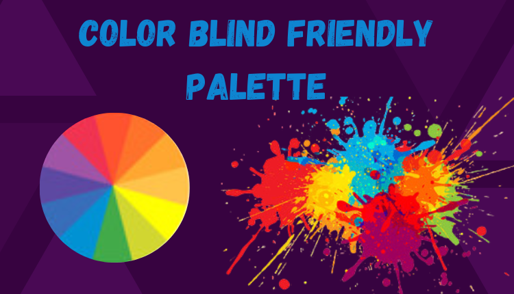
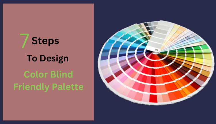
7 Steps To Design Charts With A Color Blind Friendly Palette

1. ​Plan Out Your Color Scheme Beforehand

Using a color blind friendly palette with accessible colors doesn’t mean you need to compromise on aesthetics or strip out all the color from your charts. By planning, you can ensure a color blind friendly palette compliments your design, rather than clashes.

And every palette should generate adheres to a contrast ratio of 4.5:1 as per the latest Web Content Accessibility Guidelines (WCAG) 2.1 AA.

In other words, the designs you create with these color combos will be compliant and inclusive. 

After all, if it turns out your colors aren’t particularly suited to color blind people—and accessibility is important to you—it’s better to find this out before you’ve invested considerable time and effort in your design composition.

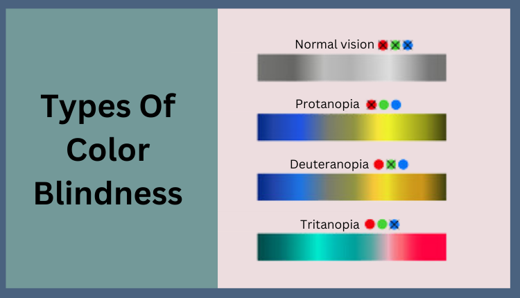
TIP: If you’re stuck, try using a tool like Coblis, a free color blind simulator that will give you a better sense of how your images will appear to people with color blindness.

2. Avoid Problematic Color Combinations

Another reason you should plan out your color scheme beforehand is so you can avoid using problematic color combinations, some of which can make your charts or infographics completely inaccessible to color blind people.

Color combinations to avoid for people with color blindness include:

If you’re stuck and absolutely must use one of these combinations, try making adjusting the shades so one is extremely dark, and the other extremely light—most color blind people can detect contrast, so this likely will make things easier.

3. Use highly contrasting colors

As previously mentioned, contrast isn’t an issue for most people who are color blind. Darken and lighten your colors, respectively, to make the contrast more pronounced. You can also play with different hues, as well as levels of brightness and saturation.

4. Use patterns and textures

Using patterns and textures in your design is a great way to incorporate visual elements into your design that doesn’t rely on color.

5. Use symbols

Symbols and icons are a great way to make your designs more accessible because they can visually punctuate a message, without relying on color.

6. Make your chart monochromatic

Because color blindness doesn’t impact the ability to distinguish between different shades, consider making your charts monochromatic. Using a restricted color palette will naturally mean there are fewer opportunities to use problematic colors or combinations.

7. Keep your design clean and simple

When you’re designing for accessibility, it’s important to keep your infographics as simple and streamlined as possible.

Adopting a minimalistic approach will help ensure your presentations are more easily understood, whether or not your audience is color blind.

Key takeaways for using color blind friendly palettes

Optimizing your infographics and charts for people affected by color blindness is important for both accessibility and inclusivity. It’s also possible to do this without compromising the aesthetic quality in the process.

The following measures can help ensure color blind people can engage with your designs:

Combining all these elements will help make your designs more accessible to color blind people. After all, the more people you can engage with, the more impactful your work will be.